The essence of any mobile application lies in its content and structure. Even if the texts, visuals, videos, and audios are exceptional individually, a complex process to accessing them can make the entire app unusable. Therefore, to craft a delightful user experience, thorough consideration must be given to how you arrange information within your app.
The small screen size of smartphones can make designing information architecture for mobile apps challenging. This emphasises the importance of employing methods different from what is used in web and desktop apps.
What is Information Architecture?
The information architecture (IA) of an app serves as the foundational framework for its content organisation. The primary goal of the designer handling IA is to ensure a user-friendly and intuitive navigation experience. This process closely resembles an architect’s task of meticulously planning and positioning key elements within a building for residents’ easy access. In most cases, mobile apps must segment their content into easily digestible parts. This facilitates swift comprehension for users and ensures efficient organisation of all the product’s features. This division must be executed seamlessly, allowing users to navigate the app effortlessly without pausing to contemplate how information is structured for them.
There exists a significant link between Information Architecture (IA) and User Experience (UX), but it’s important to note that they are not synonymous. UX encompasses a broader spectrum, which involves various facets of the user’s journey that go beyond IA’s scope. These include ensuring a pleasing interface that caters to the user’s psychological needs. In contrast, IA has a narrower focus, concentrating on the user’s objectives and minimising cognitive effort.
The roots of information architecture trace back to ancient Egypt, where librarians at the Library of Alexandria meticulously catalogued its contents on a 120-scroll bibliography. While it wasn’t labelled “information architecture” then, the underlying concept was essentially the same – a matter of practicality. In the early 1970s, the term “information architecture” gained prominence when XEROX Labs recognized the importance of structured information and developed supporting technologies.
Understanding the Information Architecture of Mobile Apps
It is evident that discussing the disparities between Information Architecture (IA) in mobile apps and desktop apps or websites is crucial. The distinct nature of smartphone usage compared to PC usage underscores this need. There are two primary considerations:
- Device Specifics and Constraints: Smartphone interaction relies on swipes and taps, not clicks and keyboard shortcuts. The smaller screen limits the number of elements that can be accommodated. Additionally, mobile internet speed can vary, necessitating optimization for faster loading times.
- Use Cases: The use of smartphones often occurs on the move or in transit. Designers must factor in potential distractions and varying viewing conditions that users may encounter.
These distinctions compel IA designers to reevaluate how content is presented in mobile apps to ensure a pleasing user experience.
Some Major Mobile Information Architecture Patterns
Numerous IA patterns can facilitate the design of your app’s fundamental structure. The critical consideration lies in the selection of these patterns.
It’s important to note that it’s not mandatory to limit yourself to employing a single mobile app information architecture pattern across the entire app. You have the flexibility to choose multiple patterns and blend them as needed. However, it’s advisable to designate a parent pattern and then employ additional patterns for specific subsections as required.
1. Hierarchy

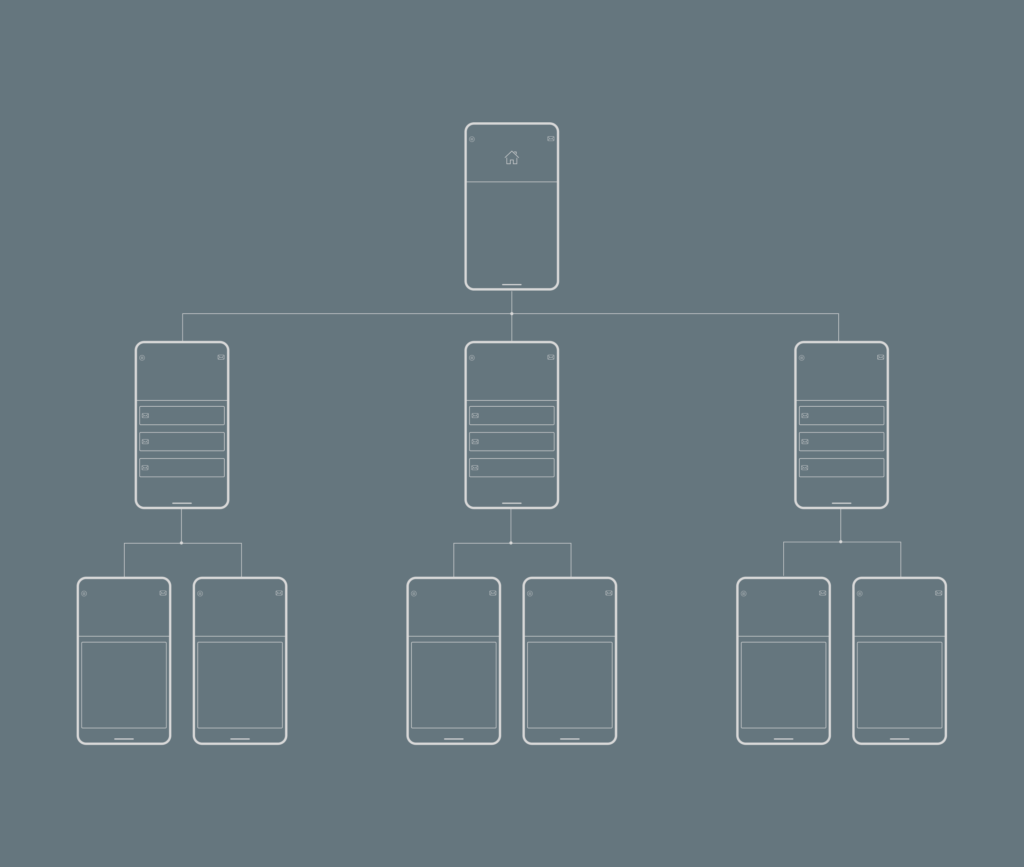
This pattern, originally designed for websites, has also been adapted for mobile app design. It is essentially made up of a single index page with links to other pages, each of which can further include links to subpages. This pattern suits mobile apps that need to replicate the structure of desktop websites. However, if it leads to a complex navigation structure on smaller screens, it may become less user-friendly. In such instances, it’s advisable to reconsider your choice and explore alternative patterns with simpler navigation.
2. Hub & Spoke

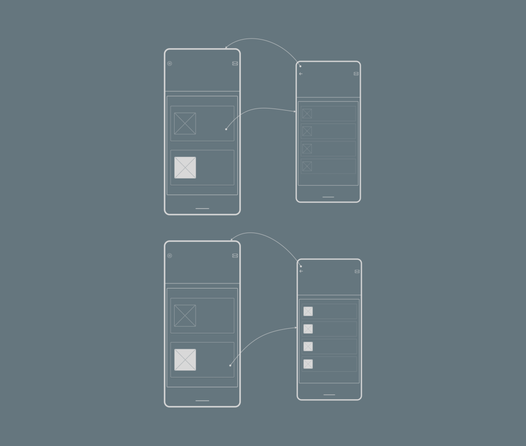
The Hub and Spoke pattern serves as the standard for iPhone apps. In this approach, you have a central index page, often referred to as the Hub, with Spokes leading to different sections. To switch to another spoke, users typically return to the hub first. Consequently, this pattern promotes a single-task focus for users. It’s particularly suitable for multi-functional apps where each tool or feature serves a distinct purpose and has its own internal navigation. However, if your app caters to users who prefer multitasking, this pattern may not be the best choice.
3. Nested Doll

This particular pattern follows a linear structure, enabling users to progress from the index page, which provides a general content overview, to pages with more detailed information. Due to its linear nature, navigation is considered straightforward, reducing the likelihood of users becoming disoriented within the app’s content. This pattern has gained popularity on Android platforms. The nested doll pattern is an ideal choice for apps centred around a single topic or a few closely related ones. Nevertheless, it’s essential to be mindful that switching between sections may become cumbersome for users if your IA has numerous levels.
4. Tabbed View

This mobile app information architecture pattern is easy for users to grasp as it mirrors the organisation of tabs in desktop browsers. Content is segmented into various sections, and users can switch between them using the toolbar. This pattern is well-suited for apps designed as versatile tools, such as those for product searches and comparisons across numerous categories and sub-categories. A prime example is Amazon, with its extensive product inventory and accessible tabbed navigation. However, it’s essential to be cautious about the complexity of your IA when using this pattern and aim for simplicity to ensure user-friendliness.
5. Filtered View

The filtered view feature empowers users to switch between various perspectives by applying filters to the displayed content. This pattern excels in offering users the liberty to personalise their content exploration. It is particularly well-suited for apps that primarily present extensive content, such as images and videos. However, it’s essential to exercise restraint and avoid overcrowding the interface with an excess of filters, as this could pose challenges when displayed on smaller smartphone screens.
How to Design The Information Architecture of Your Mobile Application
Information architecture plays a role in mobile apps similar to how concrete foundations support a house. While the following process is customised for mobile app IA, it can be readily applied to websites and even non-digital products with some adjustments.
1. Consider The Company Goals
To establish the objectives for developing IA, consider two fundamental questions: why undertake this effort, and what outcomes are desired? Collaborate with key stakeholders to ensure their involvement and consensus on the final version of your IA. Goals typically align with three categories:
- Increasing revenue.
- Cutting expenses.
- Assisting individuals in making informed choices.
Additionally, evaluate if any constraints impact these goals.
2. Determine User Objectives
Identify the individuals who will engage with the mobile app. Employ User Experience (UX) methodologies, such as conducting user interviews, crafting personas, and developing scenarios to address these key questions:
- User Activities: What actions will these users perform on the mobile app?
- User Objectives: What goals are they aiming to achieve?
Present your findings using a storytelling approach, aiding stakeholders in comprehending your insights. Collaborate to envision optimal and adverse scenarios, as well as strategies to mitigate the latter. Additionally, consider any user constraints, such as the technology they use.
By concretely defining the user objectives, you’ll be able to ascertain which features or content elements are important to the user. With this information, you can position such features or content elements within fewer taps.
3. Evaluate Competitors
Avoid reinventing the wheel unnecessarily, as it can be counterproductive. Thoroughly research your competitors to gain valuable insights. Assess their information architecture by considering the following:
- Information Placement: Where do they present their information?
- Common Information: Identify recurring content themes.
- Navigation Usability: Evaluate the ease of their app navigation.
- Strengths and Weaknesses: Analyse what aspects work well and where improvements are needed.
4. Create The Content Inventory
Before delving into selecting an IA pattern, comprehending the content elements of your IA is essential. If the mobile app already contains content, conduct a comprehensive assessment to determine what stays and what goes. For entirely new mobile apps, you have the luxury of starting with a clean slate. A thorough grasp of the content is imperative.
Compile an exhaustive inventory of all necessary app content, including titles, meta elements, multimedia, text, documents, and more. This facilitates content grouping, prioritisation, and the elimination of unnecessary components. You can employ card-sorting techniques to assist in content categorisation.
Card sorting is a participatory design method, which involves grouping various items into distinct categories using printed cards featuring terms, features, or concepts. Ultimately, these grouped names can evolve into a mobile app menu and map.
5. Define Navigation and Create Mobile App map
Now that you’ve organised your content, the next critical question pertains to how users can access and interact with this content. Before delving into the creation of a mobile app map and navigation structure, it’s imperative to establish your IA. Often, navigation represents merely the visible aspect of a more extensive framework.
Information architecture, though generally hidden from visitors, serves as the app’s foundational structure. This structure can be visually represented using spreadsheets and various types of diagrams, referred to as a mobile app map.
To craft a mobile app map, begin with organised and labelled content, which is then presented diagrammatically. Once this foundation is laid, you can proceed to construct navigation, a collection of user interface elements thoughtfully interconnected. You can employ wireframing to visually conceptualise how a particular page or screen might appear, facilitating discussions with other stakeholders. Wireframing primarily focuses on the organisation of IA elements rather than the other intricate aspects of visual design like colours and font styles
6. Ensure Simplicity
This stands as one of the paramount considerations when crafting the information architecture (IA) for a mobile app. Due to the limited screen real estate on smartphones compared to tablets or desktops, meticulous content prioritisation is essential. In essence, include only the absolutely indispensable components. Keep in mind that a streamlined IA is more effective.
Here are some strategies to streamline your IA effectively:
- Restrict the number of links to fewer than 10.
- Minimise the structural levels.
- Eliminate pages with minimal or no content; each page should hold navigational value.
- Ensure your links and menu options are concise yet comprehensible.
7. Rely on User Testing and Feedback
The most effective approach to assess the user-friendliness of the information architecture (IA) you’ve crafted is to engage potential users. Invite them to interact with the app and collect their feedback. This process is vital before the app’s release and should continue post-launch. Several testing methods can validate the efficacy of your IA, and the Nielsen Norman Group recommends four types based on your design phase and objectives:
A. Tree Testing
This quantitative method gauges whether essential information is easily located within the mobile app IA. Participants navigate exclusively via link names. Tree testing evaluates the clarity of category names, their alignment with content, distinctiveness of titles, and information accessibility.
B. Closed Card Sorting
This approach assesses the appropriateness of category names, employing both quantitative and qualitative dimensions. It examines whether category names accurately convey content.
C. Click Testing
Quantitative in nature, this method reveals how users utilise available UI components. It identifies which navigation elements receive attention and which are bypassed or avoided.
D. Usability Testing
This is a qualitative method that gives insights on how and why users interact with a mobile app. It unveils how users locate information, their preferred methods, their disregard for certain elements, and the reasons behind their choices.
If all four tests are not feasible, prioritise usability testing paired with an interview at the conclusion. This approach provides valuable insights into users’ favourite features, their interactions on your mobile app, and the rationale behind their behaviours.
8. Review The IA Frequently
Everything is susceptible to getting outdated. While your current IA may offer a flawless user experience, it could lag behind competitors in a few years. Staying attuned to the latest IA design trends is crucial. Also, even rigorous testing cannot guarantee a seamless UX throughout the mobile app lifecycle. Therefore, it is important to collect feedback and employ it to adapt the IA accordingly.
Conclusion
Information architecture plays a vital role in ensuring users comprehend and enjoy your mobile app. Due to the constraints of the smartphone, you should aim to establish a structure that users not only understand but can also anticipate. This reduces the need for them to search endlessly and allows them to navigate your app with ease.
It’s essential to recognize that effective information architecture and solid UX design are closely intertwined. Interacting with your mobile app should feel intuitive and uncomplicated. Make the most of opportunities to test your information architecture and ensure users are not frustrated by the presentation of information.
- Creating Information Architecture (IA) for Mobile Applications - October 2, 2021
- What is Market Pull? Some Proven Examples - September 4, 2021
- What is Competitive Advantage? Types and Examples - August 9, 2021
